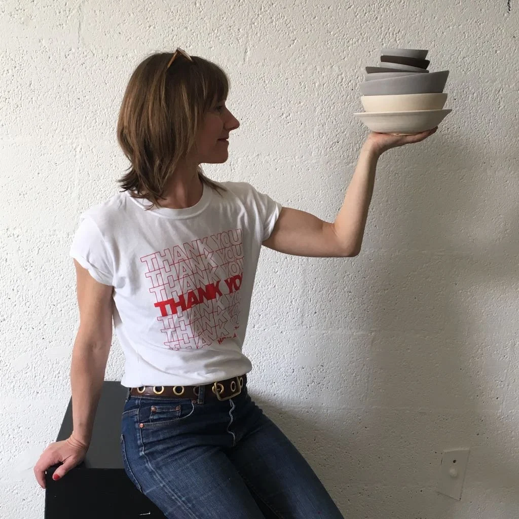
I came to ceramics through a perfect storm of past creative ventures. My background in graphic design and photography led me to find inspiration in the humble medium of clay.
Ceramics
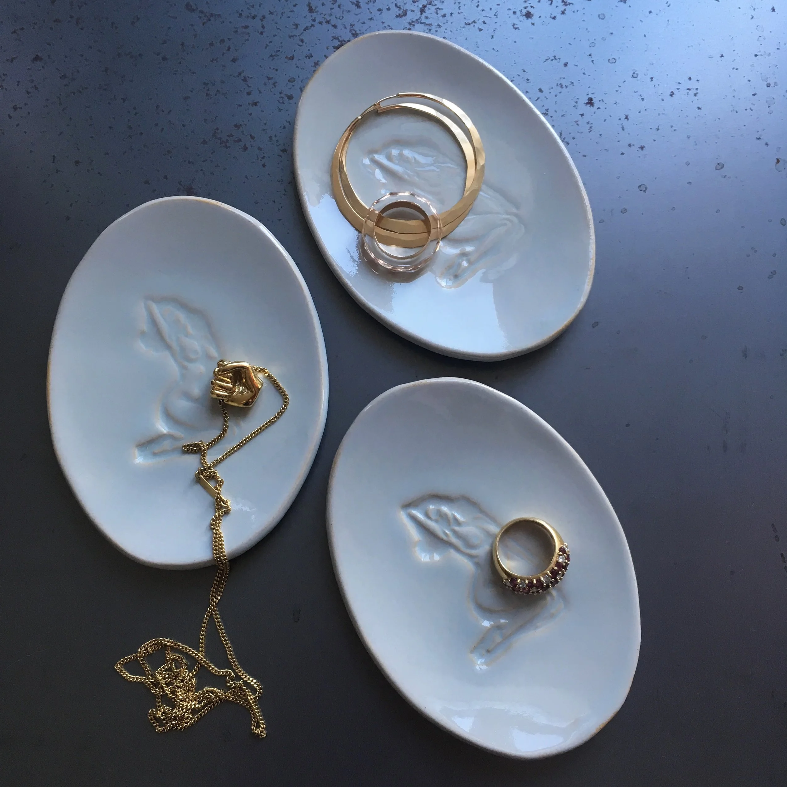
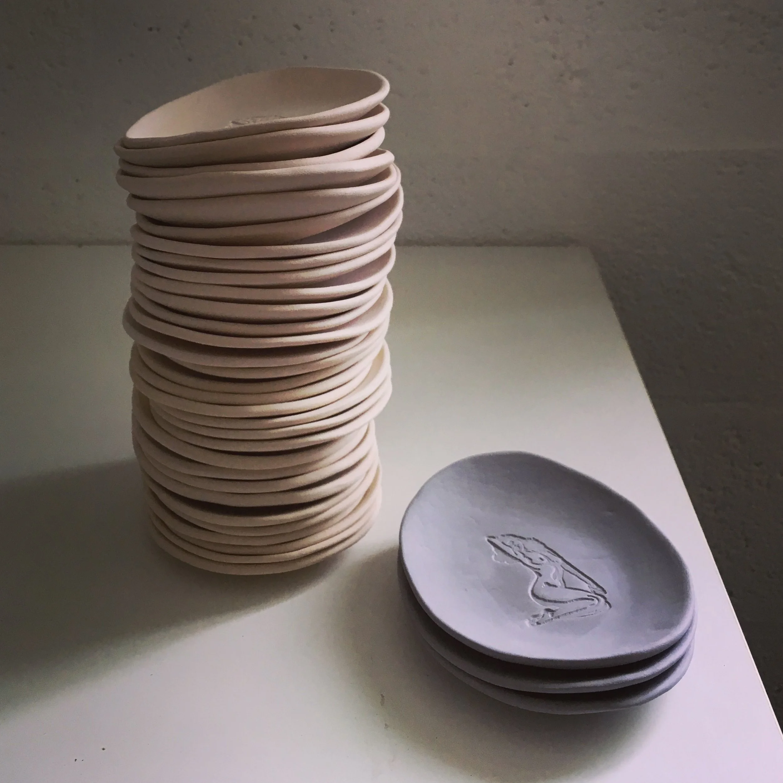
The Ladies collection is provocatively inspired by the theme of consent. In conversations surrounding sexual assault and violence, we notice that much of the response is centred around trying to understand the perpetrator. The idea that we can keep ourselves from compromising situations by controlling our behaviour, appearance and whereabouts, does nothing to help women. This mindset keeps the focus on what the victims did ‘wrong’ and promotes ideas about how ‘good’ and ‘bad’ women behave. We stand with a culture of non victim-blaming. With this collection, we spotlight our lovely pin-up girl to show that women can and should be allowed to be sexy without being accused of “asking for it”.
These dishes are the perfect size to keep your jewellery in good company.
The Ladies collection plays with the notion of how good vs bad women behave and is inspired by the injustice of a “She’s asking for it” culture. No woman should be made to feel responsible for assault or violence.
DIALOGUE
The Dialogue collection is a collaboration between Sophie Eekman and Type Designer, Laura Meseguer. Using a harmonisation of new fonts (by Laura) and traditional techniques (Sophie), the design and messaging aims to be an engaging experience for the user. These pieces were made with the realisation that we are living through a time with the highest levels of refugee displacement on record.
FOOD FOR THOUGHT
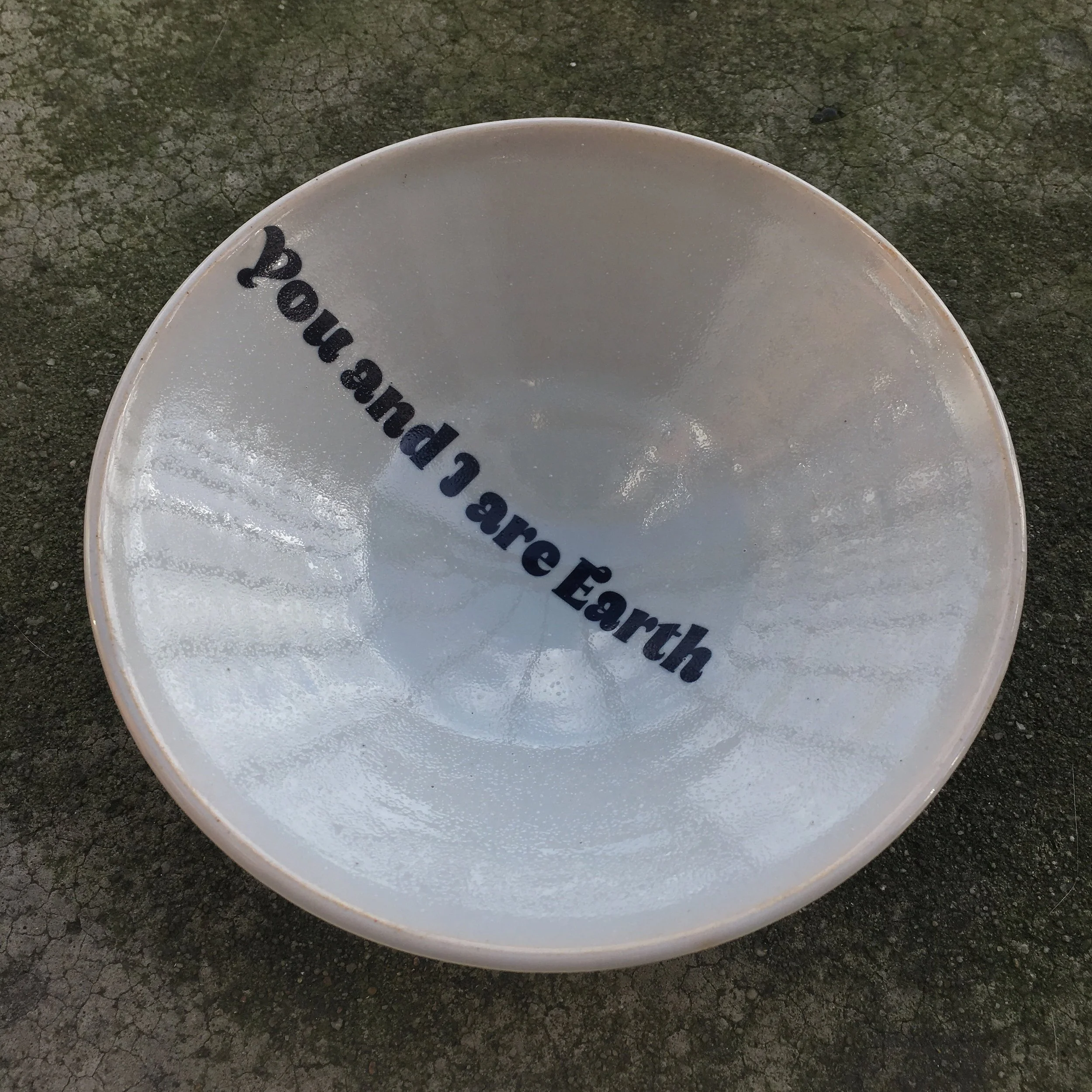
The statement “You and I are Earth’ is an age-old reflection dating back to 1660s, and reminds us of our responsibility to be more welcoming. The ceramics (much like us) are vessels made of earth and are also used here to represent the unifying power of food and sharing as a way to encourage cross-cultural dialogue and connection.
DELFT BLUE
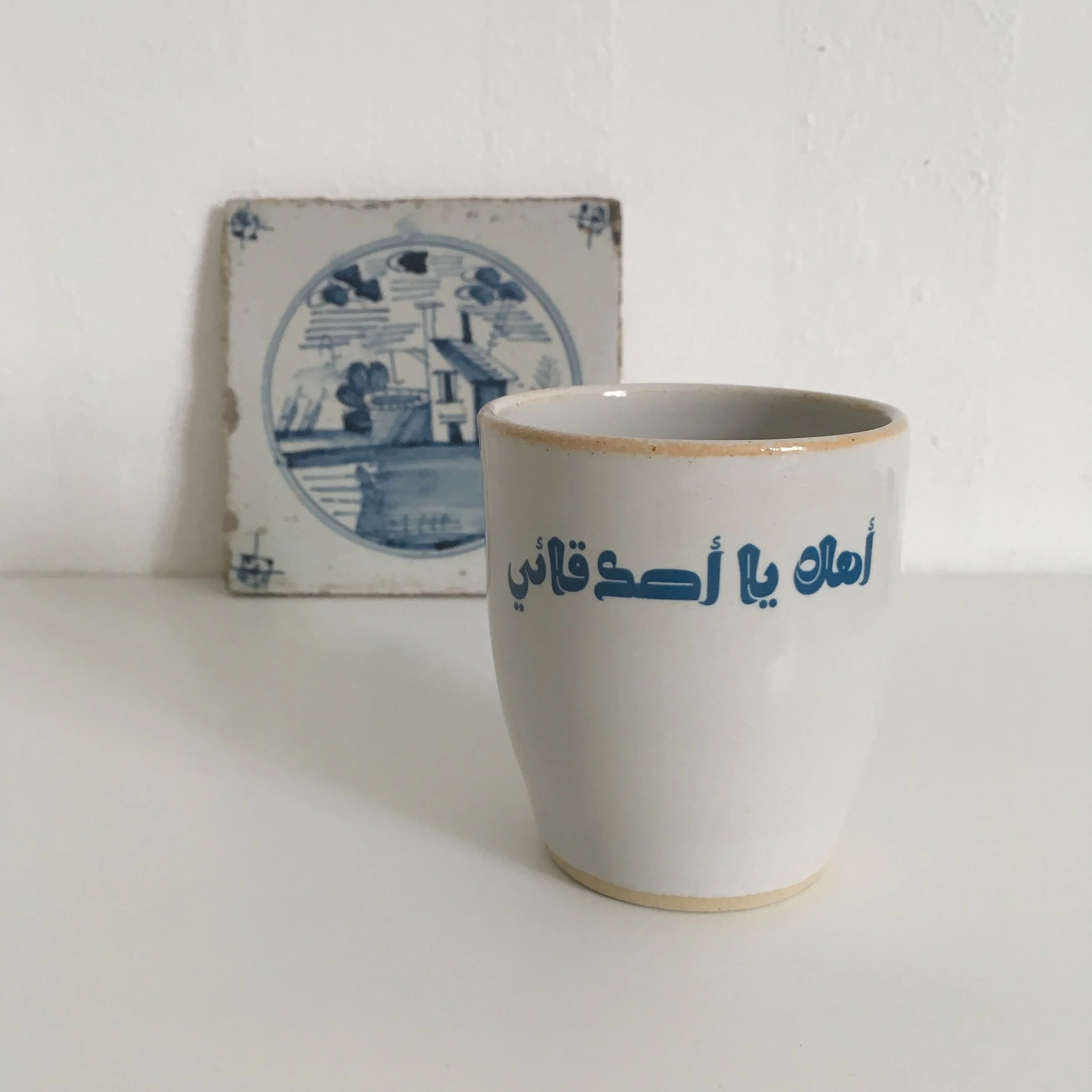
The inspiration for glaze and color came from a traditional Dutch tile with a tiny house. Considering the destructive and oppressive history of Dutch colonial settlement, we chose to reinterpret this classic style to express a message of hospitality and welcoming.
CUPS
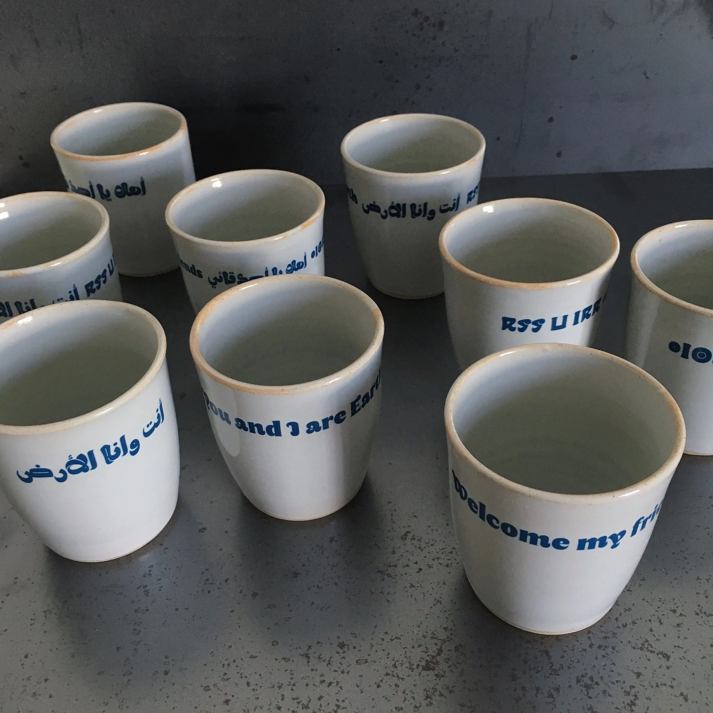
These are the first cups we made, to experiment with what size font would be best and decide on the colour of blue we will use for the transfers.
YOU & I
The statement "You and I are Earth’ is an age-old reflection dating back to 1660s and reminds us of our responsibility to be more welcoming. The ceramics (much like us) are vessels made of earth and are also used here to represent the unifying power of food and sharing as a way to encourage cross-cultural dialogue and connection.
Tin-glazed earthenware plate found in a London sewer. This statement resonated strongly with us. While we’re often separated by race, class, religion, geography, we’re unified by the same basic human needs: a safe home, food, love and connection.
Octagonal plate, ©Christie’s 2018
WELCOME
Only four examples with this inscription and date have been found. It has been suggested that they’re made and decorated by Dutch potters active in England, as the nuances of spelling and calligraphy appear more Dutch than English.
Laura is a graphic and type designer from Barcelona. A talented and cultivated collaborator, her specialty is in producing lettering and typefaces for brands and publishing. Laura’s work passionately reflects a blend of function, expressivity and artistry. Laura is collaborating on all things typography, lettering and fun story telling.
A BIT ABOUT THE TYPEFACES
The rhythmic and featured font in this collection, Qandus, is a modern interpretation of a handwritten style by a renowned Moroccan Sufi calligrapher of the nineteenth century, al-Qandusi. The typeface and its name (Qandus) are an homage to this calligrapher’s unique work and its graphic expressiveness. Created as a collaboration between font designers: Kristyan Sarkis (Arabic), Laura Meseguer (Latin) and Juan Luis Blanco (Tifinagh), Qandus explores the typographic possibilities and traditions of each respective script.
QANDUS, MODERN YET ROOTED IN TRADITION
Kristyan Sarkis: “Qandus is by all means a modern happy family. Much like modern families, Qandus is diverse, inclusive and tolerant to the family members’ differences. All its members respect each combination, work well together to achieve different tasks, yet they are all individuals with different personalities and characters. Qandus is a family that is aware of its beautiful traditions and characteristics and passes it on from generation to generation over a span of a millenium on a very large land. With the essence of their ancestors, the members of the Qandus family step confidently into present day, aware of the role they have to play in contemporizing and keeping those traditions alive.”


